B2C/B2B2C Energy Optimization App
OPTIWATT ENROLLMENT
Project OVERVIEW
-
About
Optiwatt helps EV owners optimize energy usage and save money by connecting smart devices to utility programs that reduce grid stress. Enrollment in those programs is the core of the business, every enrolled user unlocks contract opportunities with utilities. Getting users from sign-up to enrolled, keeping them there, and having an impact on emissions is everything.
-
Project details
Sector: Climate / Energy
Project Type: UX/UI Design / Product Strategy / User Research
Challenge: A leaking funnel and a confusing core feature were quietly undermining Optiwatt's ability to grow utility partnerships and retain users at scale.
Team: Leo Gonzalez - Staff Product Designer
CG Chen & Jard Hirata - Designers
Rajesh Nerliker - VP of Product
Optiwatt Developers
Design Brief
-
Problem
Sign-up conversion sat at 25% and enrollment completion at just 8%, well below industry benchmarks. Meanwhile, Smart Charging, our key retention driver, was generating steady support complaints. Users didn't understand it, so they unenrolled. Left unaddressed, this directly threatened our utility contract pipeline.
-
Project Goal
Move three numbers: sign-up conversion, enrollment completion, and retention. Beyond the metrics, the deeper goal was a scalable enrollment architecture, one flexible enough to support any utility program without custom design work every time, unlocking faster contract growth.
-
Strategy
I pushed for discovery before solutions. PostHog told us where users dropped off, research told us why. My core bet: the enrollment flow's device-first framing was the wrong mental model. Users want to save money, not configure a charger. Reframing enrollment around programs and outcomes, not devices, was the strategic pivot. I used UX Pilot for rapid AI-assisted ideation and built a program-agnostic design system to make future utility onboarding a content operation, not a design sprint.
Key Results
-
44%
Sign up conversion rate, increase from 25% prior.
-
18%
Enrollment conversion rate, increase from 8% prior.
-
36%
Reduction of customer support tickets related to smart charging.
Discovery
Discovery
Exploring user needs and market gaps to create the right product.
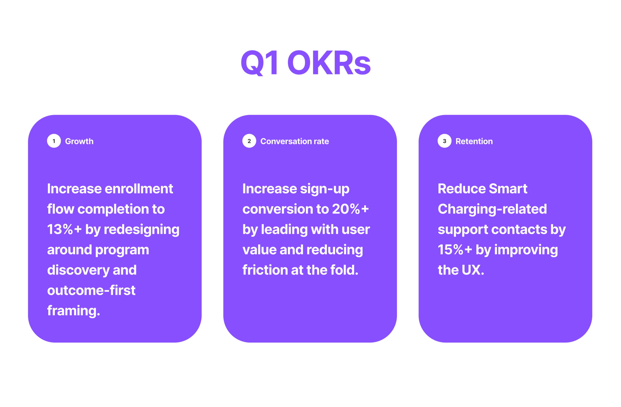
PROJECT OKRS / METRICS
Before a single screen was designed, the team established clear OKRs to align the team on what success looked like — and to ensure every design decision could be traced back to a measurable outcome. Our strategy was focus on high impact metrics to drive our business goals and support partner needs.
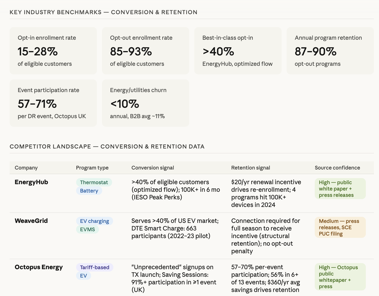
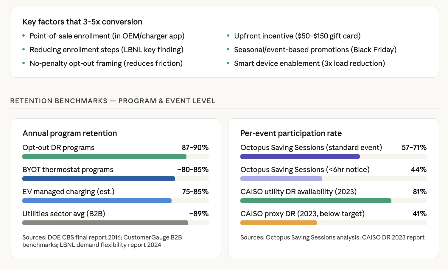
COMPETITIVE ANALYSIS
I used AI to synthesize competitor conversion and retention data across the energy tech landscape, benchmarking against EnergyHub, WeaveGrid, and Octopus Energy. The research revealed that best-in-class opt-in enrollment hits >40%, annual program retention reaches 87–90%, and key conversion multipliers include reducing enrollment steps, upfront incentives, and smart device enablement. Optiwatt's 8% enrollment rate had clear room to move — and a clear playbook to learn from.
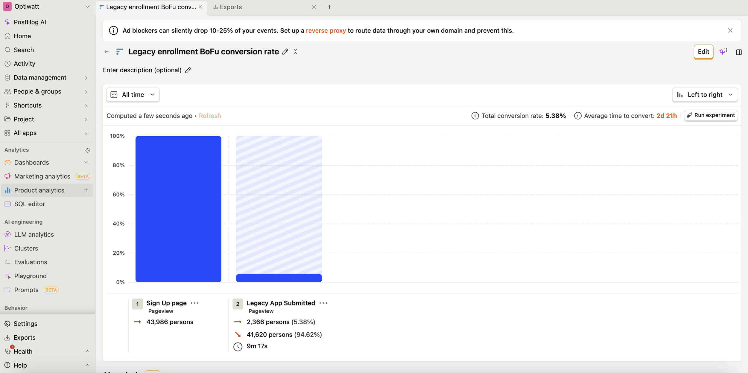
POSTHOG FUNNEL ANALYSIS
Before jumping to solutions, we needed hard data on where users were falling off. The team set up a PostHog funnel to track our legacy enrollment conversion rate, which revealed a concerning 5% conversion rate. Beyond the numbers, PostHog's session recording capabilities allowed us to watch real users navigate the experience — surfacing friction points and behavioral patterns that raw data alone couldn't explain. These two signals together gave us the foundation to build a confident, evidence-based design strategy.
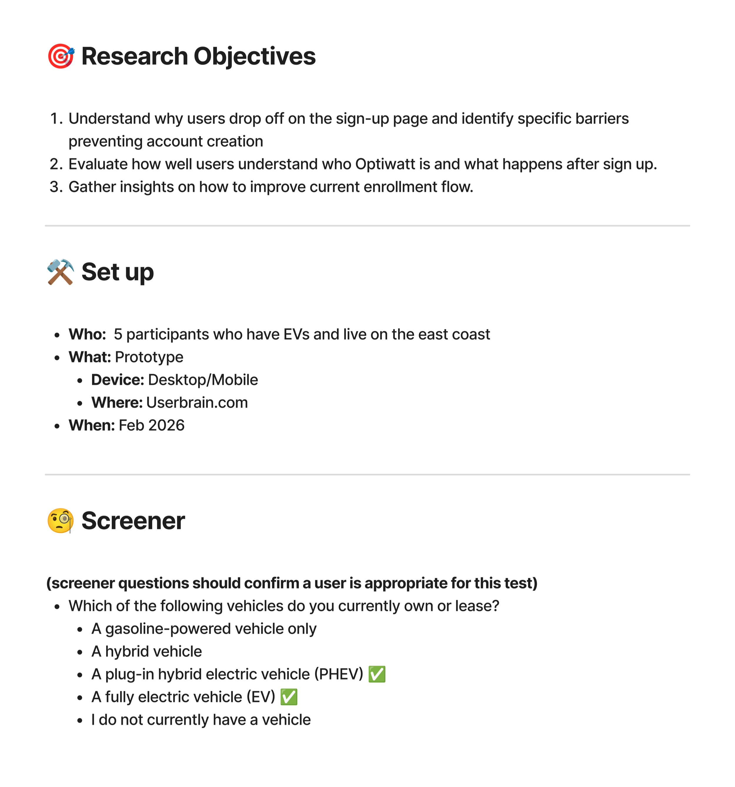
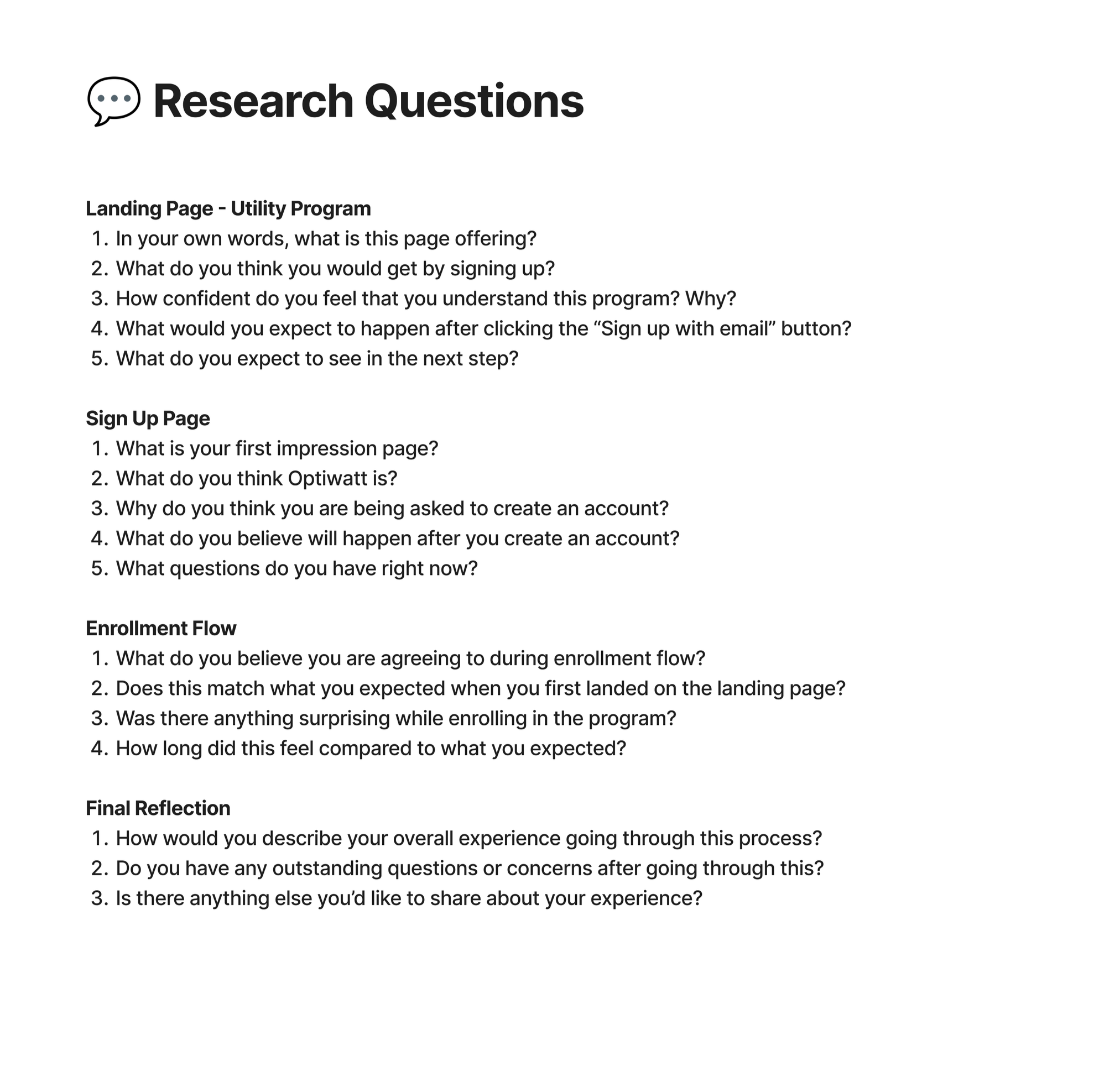
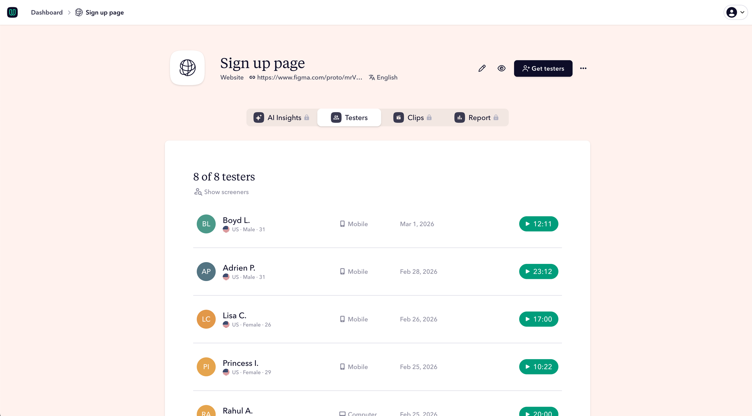
User Testing
Levering our existing sign up to enrollment flows we decided to conduct unmoderated usability testing to gather information on user expectations and understanding of the entire Optiwatt core experience.
User Testing Objectives:
Understand why users drop off on the sign-up page and identify specific barriers preventing account creation
Evaluate how well users understand who Optiwatt is and what happens after sign up.
Gather insights on how to improve current enrollment flow.
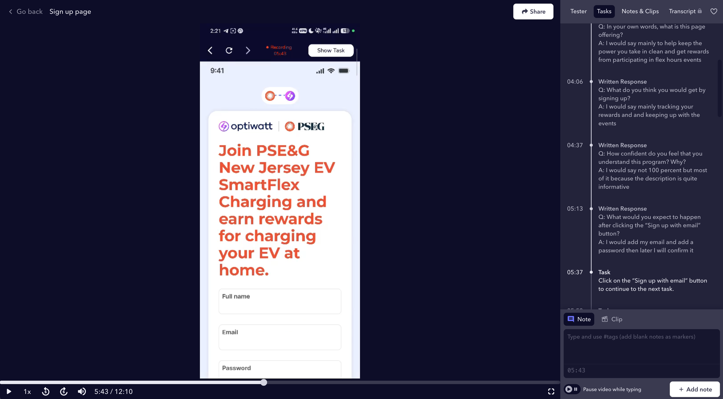
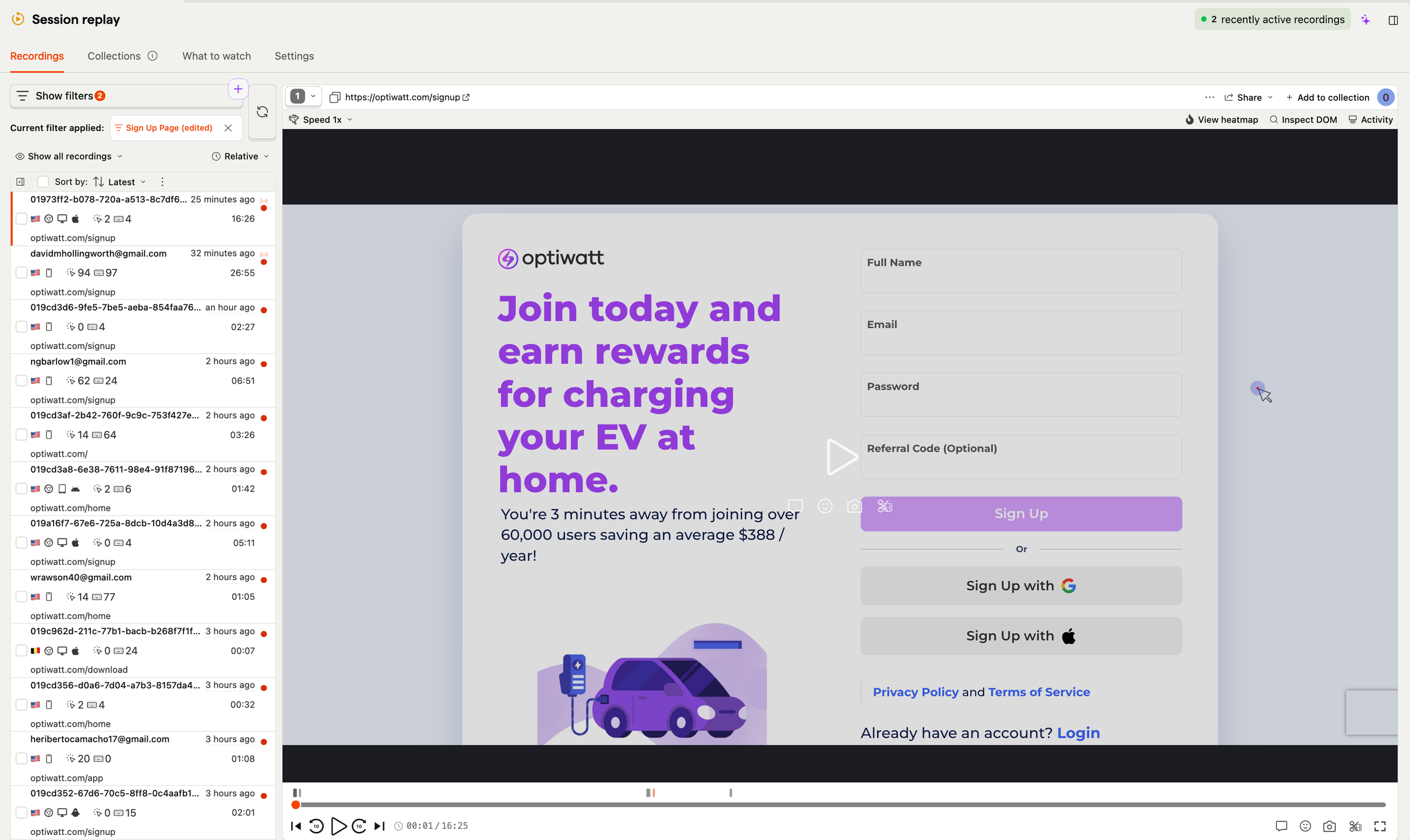
Userbrain Usability Testing
With PostHog data pointing to where users dropped off, I launched an unmoderated usability study through Userbrain to understand why. Participants navigated the full sign-up to enrollment journey on their own, giving us authentic, uninfluenced session recordings to analyze. Userbrain's AI-driven insights automatically surfaced patterns across sessions — dramatically accelerating synthesis and ensuring no critical friction point was missed. The findings fed directly into the research debrief I presented to the full cross-functional team.
SHARING RESEARCH INSIGHTS
Users arrived motivated, save money, be sustainable, but the sign-up page didn't reinforce that, causing early drop-off. The device-first enrollment flow asked users to make technical decisions before explaining why they mattered. Smart Charging offered no feedback on whether it was working, breeding distrust. [Support contacts tied to Smart Charging confusion confirmed this was costing us operationally, not just in retention.]
DEFINE
DEFINE
Turn research into clear objectives, create a roadmap, and establish product priorities.
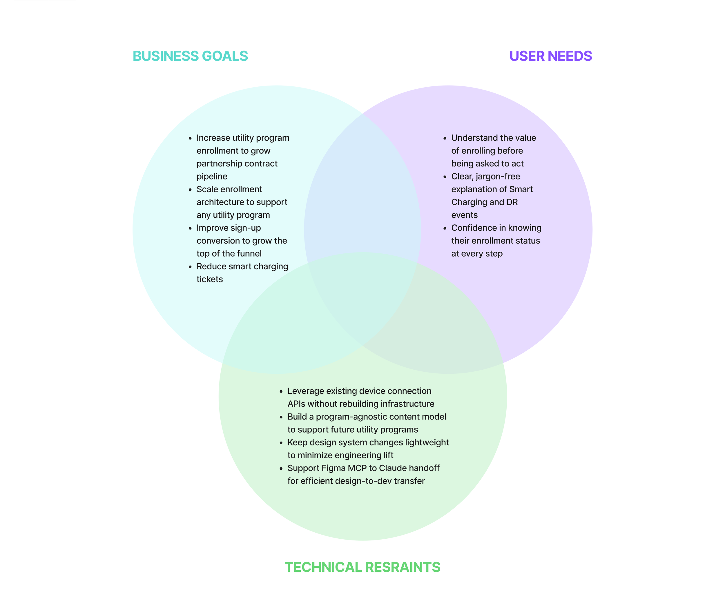
Aligned Project Goals
Research reordered our priorities. The real problem wasn't individual screens, it was that the entire flow was organized around our technical architecture, not the user's goal. In our alignment session, we mapped business goals, user needs, and technical constraints into a shared framework that gave the team a clear lens for every trade-off that followed.
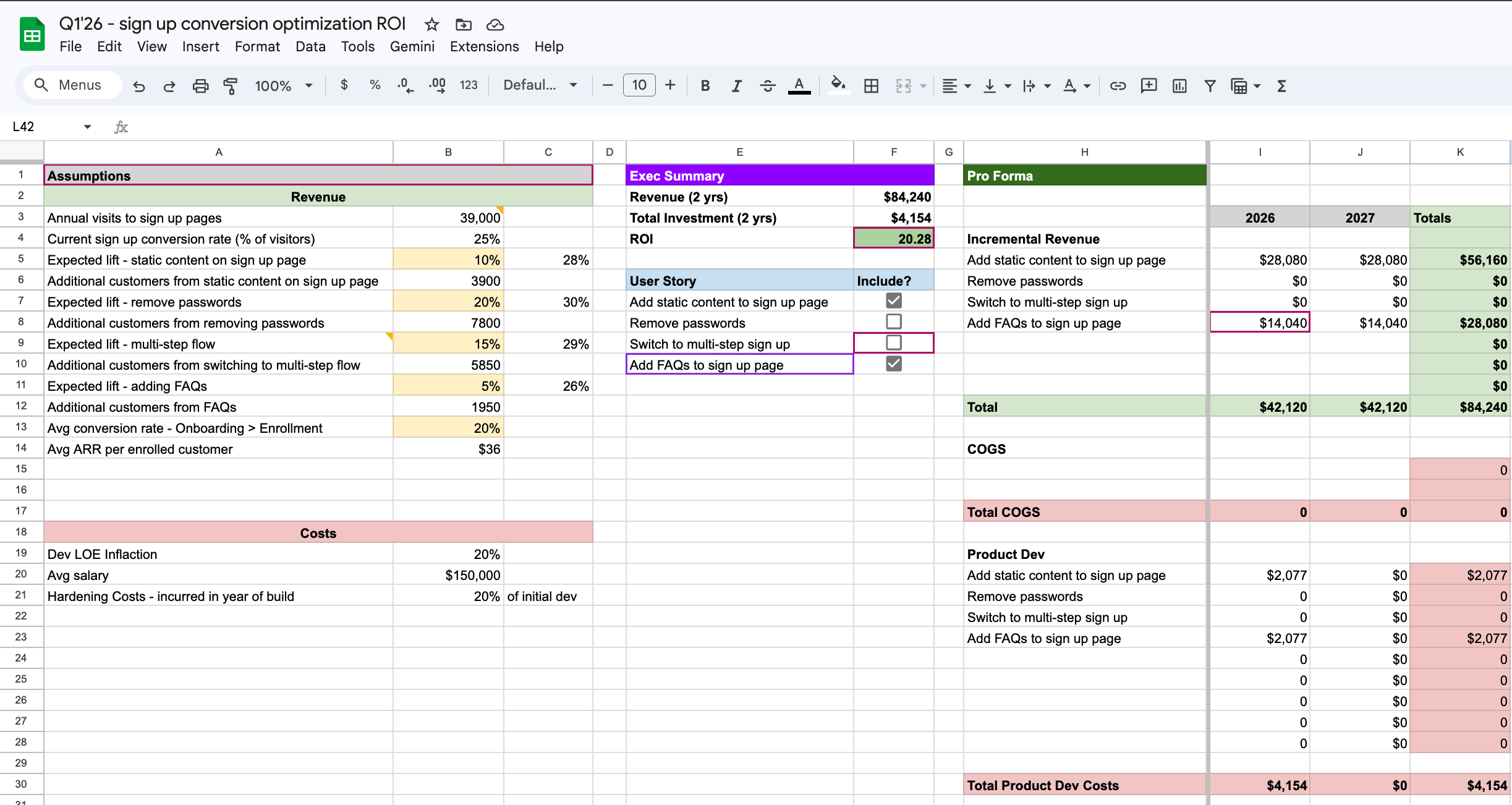
ROI ANALYSIS
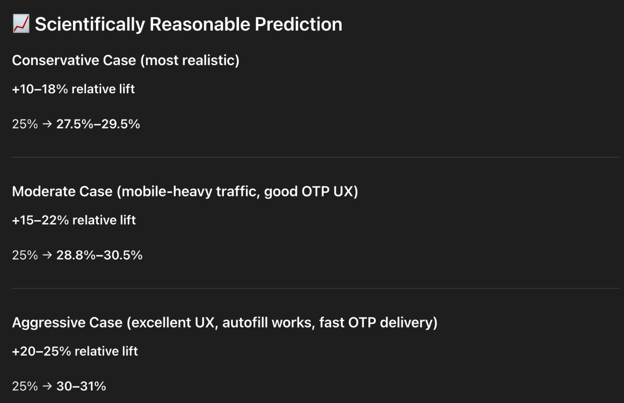
The PM and I built an ROI plan to align leadership on the sign-up page investment. Using PostHog data and AI-generated benchmarks, we modeled the revenue impact of improving conversion from 25% to 30%+ — showing that each percentage point directly expanded utility enrollment volume and contract value.
Also I leveraged ChatGPT to put together an ROI analysis if we switched over to OTP to better understand how this could impact conversion/lift.
Product Roadmap
We sequenced work across three streams: sign-up page first (highest leverage, lowest complexity), enrollment restructure second (most strategic), Smart Charging last (retention impact, needs enrolled users to show signal). Anything requiring custom per-program engineering was explicitly deprioritized in favor of the scalable system we were building toward.
IDEATE
IDEATE
Brainstorm, refine ideas, and explore different approaches to shape the product’s direction.
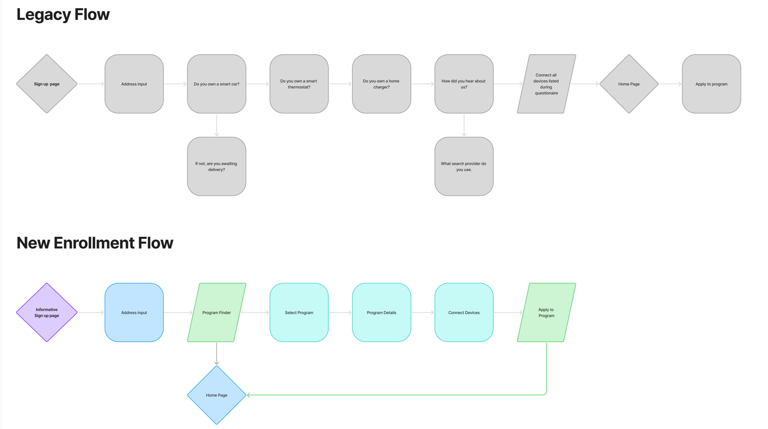
UPDATED USERFLOW
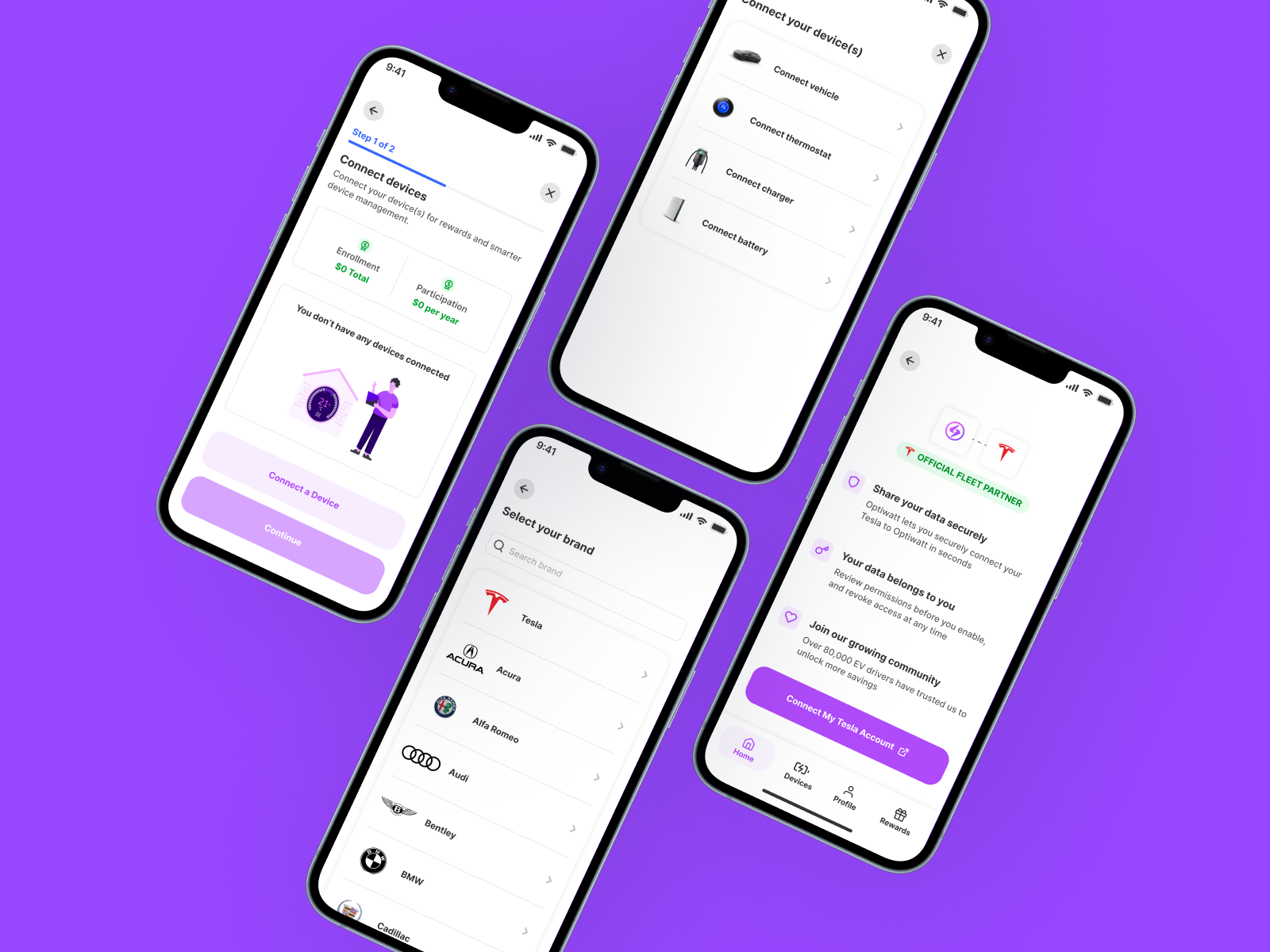
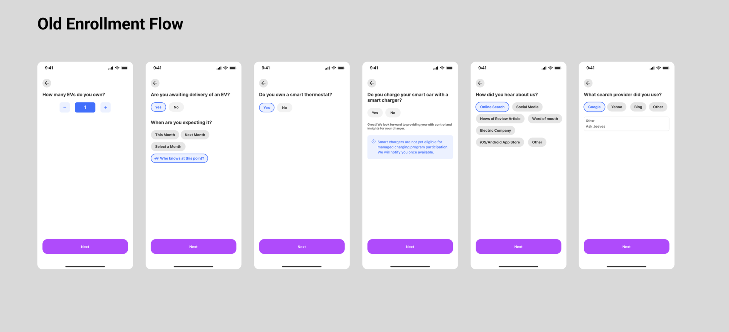
Mapping the legacy flow revealed the core problem — a device-first architecture that buried program value behind technical setup, organized around how the product was built rather than how users think.
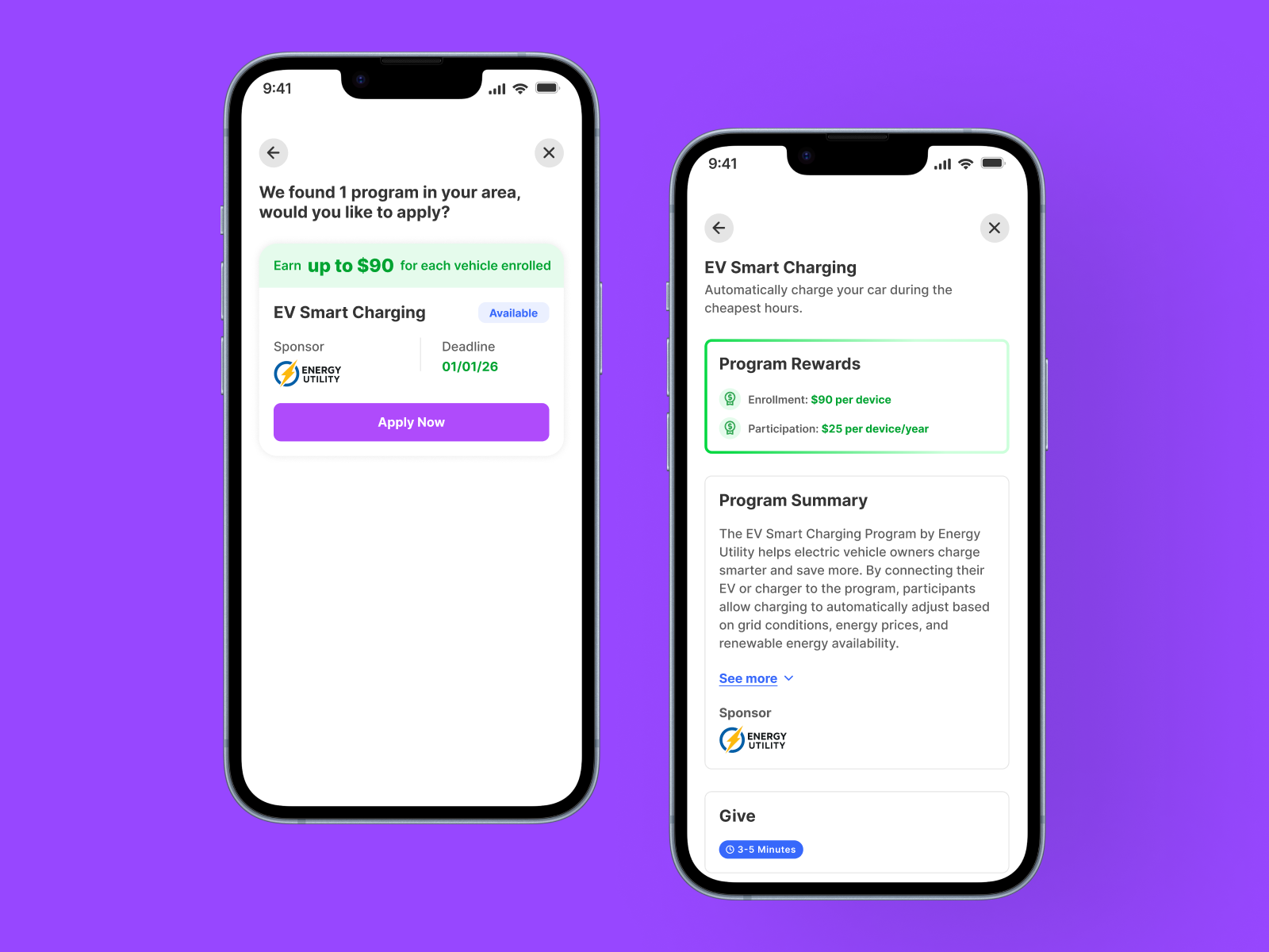
The new flow fixes this by leading with address input to confirm eligibility upfront, then routing users directly into program discovery. Fewer steps, clearer intent, and value surfaced in the first minute.
AI INITIAL DESIGN EXPLORATIONS
I used UX Pilot to rapidly generate and pressure-test layout directions, then refined in Figma — walking into stakeholder reviews with multiple informed directions instead of a single proposal. Key lo-fi decisions: lead sign-up with a concrete savings claim, use a card-based program finder surfacing eligibility upfront, and introduce a persistent progress indicator throughout enrollment.
Prototype
Prototype
Develop a functional model to replicate the user experience and validate features before full development.
Branding
The legacy enrollment UI had drifted from Optiwatt's clean, energy-forward identity. I updated the design system to be more scalable and flexible. The benefit-forward framing on sign-up, status-driven UI patterns in enrollment, and active/inactive program badges made the interface feel responsive and intelligent rather than static.
Design System
Every future utility program needed to work within the same system without custom design work. I built program cards, enrollment step modules, status indicators, and benefit callouts as flexible components driven by structured content — not hardcoded layouts. New utility programs become a content operation, not a design sprint. I used UX Pilot for component ideation, Figma for build and spec, and Claude via Figma MCP to generate a live prototype and streamline the design-to-dev handoff — significantly reducing translation friction between design and engineering.
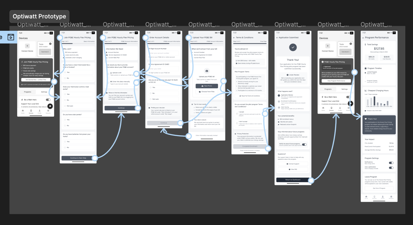
Figma Make + MCP Handoff
Once designs were finalized, I used Figma Make to build a fully interactive, code-ready prototype of the sign-up page and enrollment flow — giving developers a live, accurate reference rather than static specs. From there, Figma MCP with Claude translated the designs directly into implementation-ready code, eliminating annotation cycles and back-and-forth. The result was a significantly faster build and a handoff process that's now a repeatable standard for how design and engineering ship together at Optiwatt.
High-fidelity wireframes
I designed high-fidelity wireframes approved by the product manager and engineering lead for usability testing. Testing the concept before development is crucial to ensure it meets user needs and identify potential issues early. This approach minimizes the risk of costly revisions and ensures the final product aligns with user expectations, business goals, and technical constraints.
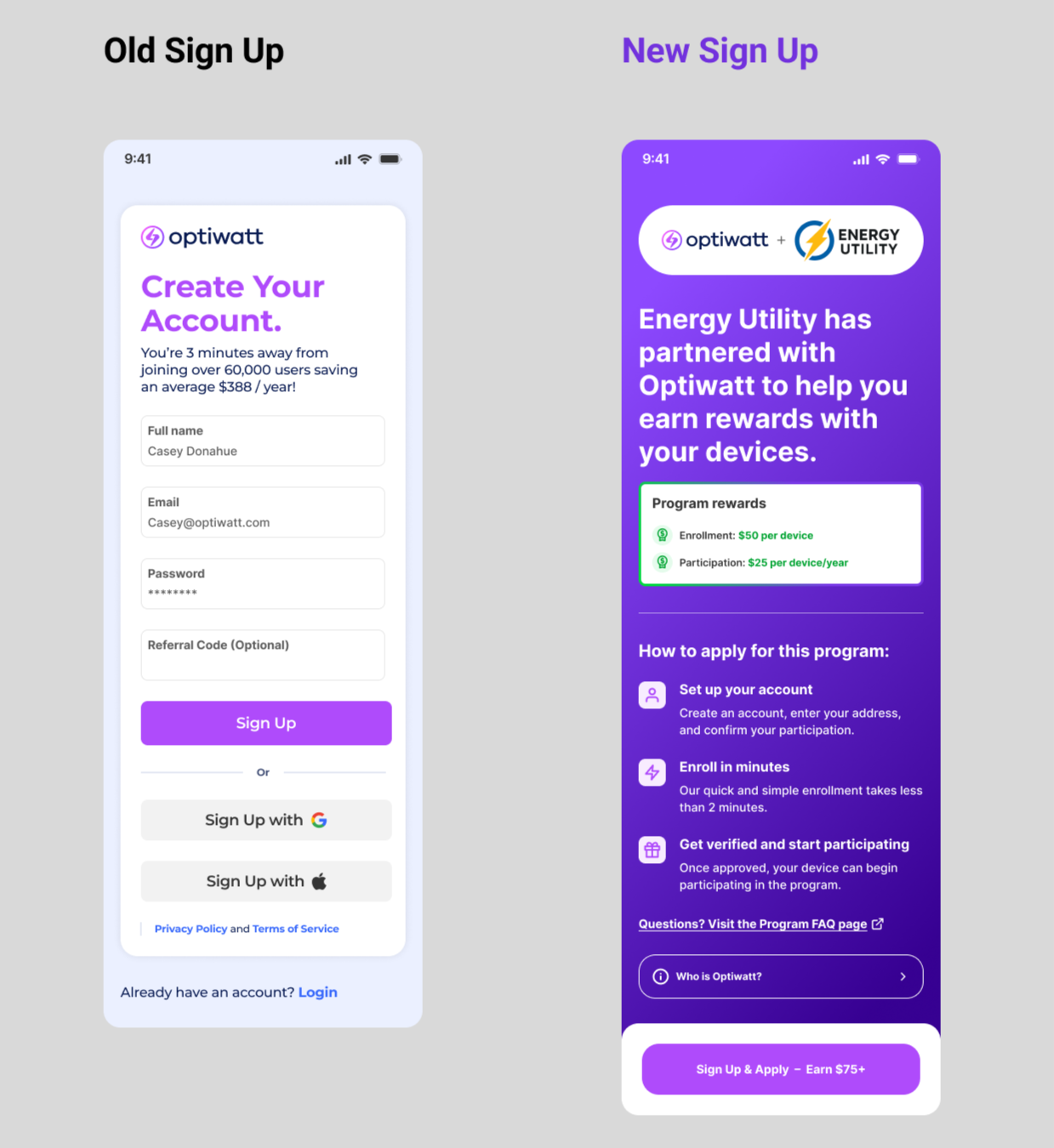
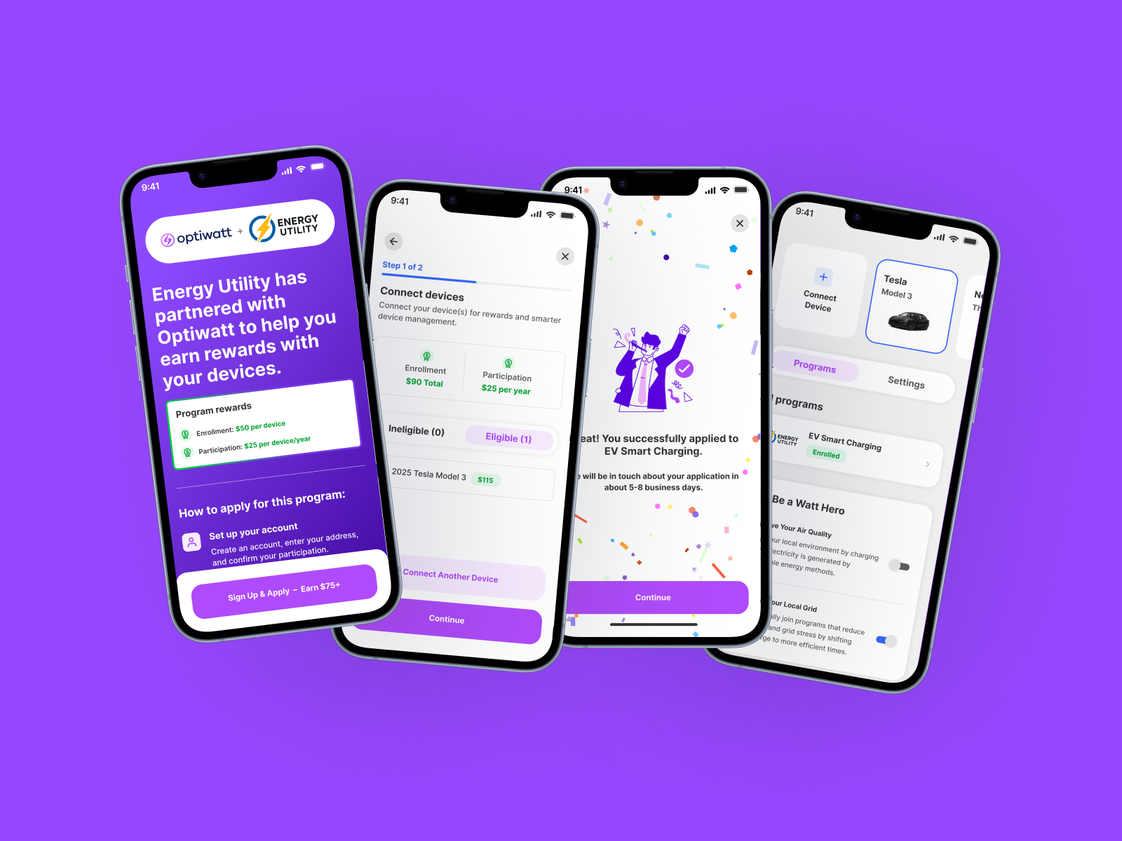
Sign-Up Page Redesign
PostHog funnel data and user research made it clear the sign-up page wasn't doing enough to earn the click. I redesigned it to lead with what matters — who Optiwatt is, what programs are available, and what rewards users can earn. A co-branded design builds immediate trust, a simple three-step enrollment overview removes uncertainty, and a fully responsive layout ensures a seamless experience across every device.
SMART CHARGING Redesign
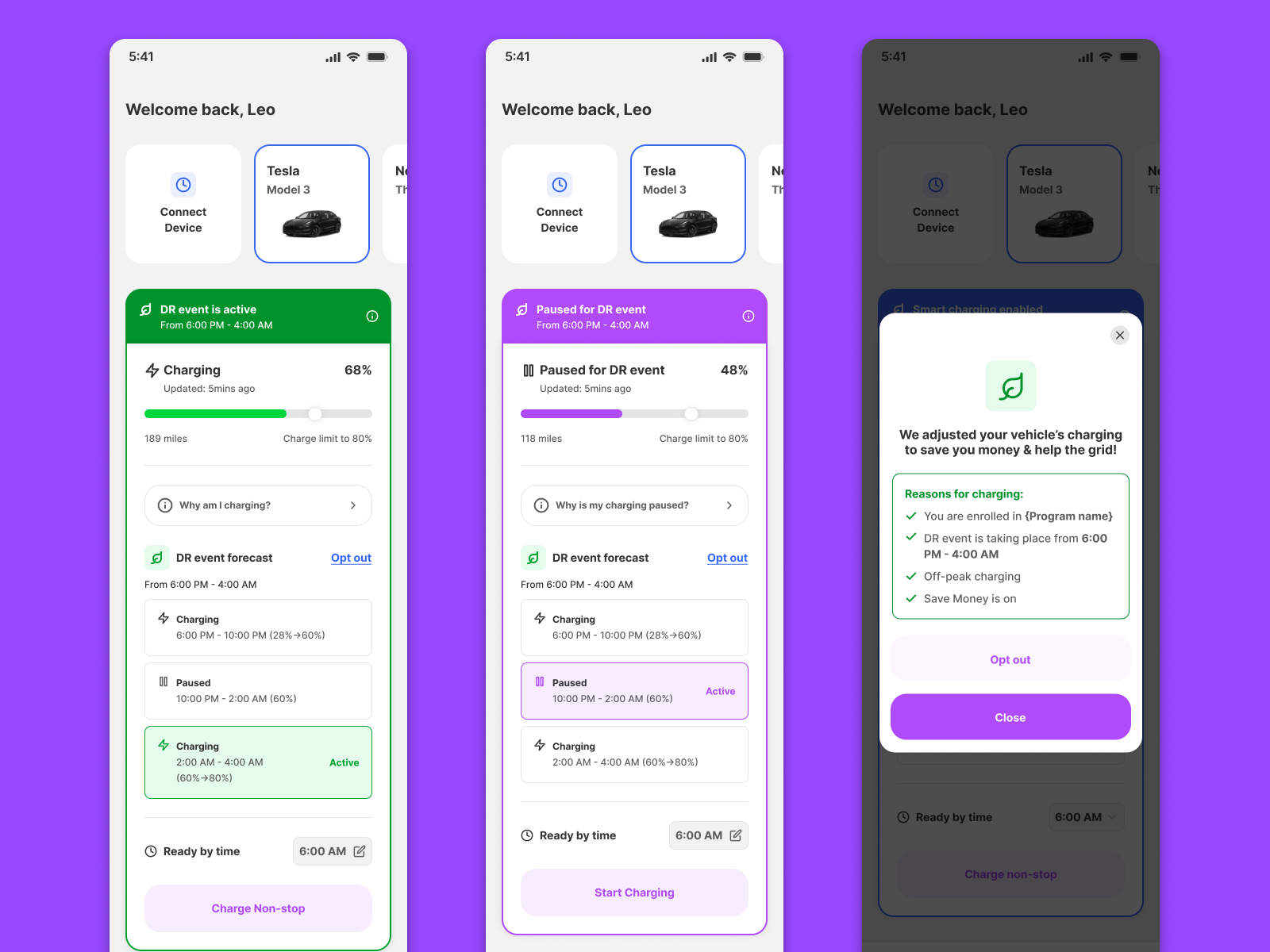
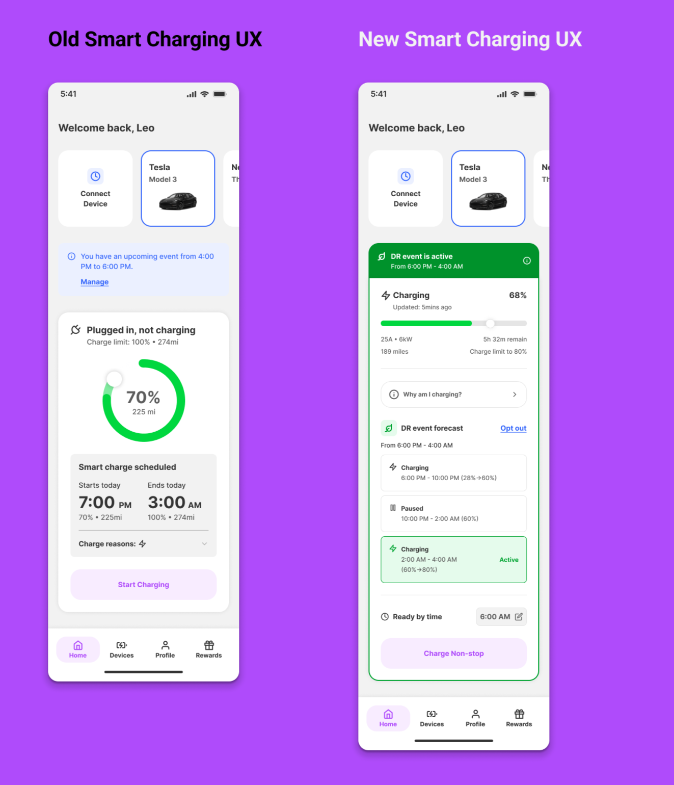
Customer support reports and user research pointed to one core problem — users couldn't tell what Smart Charging was doing, so they turned it off. I redesigned the experience with three targeted fixes: a charging schedule timeline for visibility, a color system for every charging state, and a contextual modal explaining why Smart Charging is acting on their behalf.
OUTCOMES
OUTCOMES
Performance metrics, testing insights, project reflection & next steps in product development.
Key Results
-
44%
Sign up conversion rate, increase from 25% prior.
-
18%
Enrollment conversion rate, increase from 8% prior.
-
36%
Reduction of customer support tickets related to smart charging.
Post-Launch Funnel Analysis
After launch, we returned to PostHog to measure impact against our baseline. The funnel data showed a clear upward trend in sign-up conversion, climbing toward 44% — up from a pre-launch rate of 25% and surpassing the industry best-in-class benchmark of 40%. The data validated the core design bets: leading with value, reducing friction, and co-branding the experience drove meaningful top-of-funnel growth that directly expands our utility enrollment pipeline.
FUTURE ROADMAP
With the core funnel redesigned and Smart Charging overhauled, the roadmap shifts toward personalization and scale. Working closely with the PM and engineering lead, I facilitated a post-launch roadmap session to align on priorities — sequencing quick wins first, then longer-term bets that build on the foundation we established. Every initiative traces back to a signal from research, funnel data, or user feedback, ensuring the team stays focused on work that moves the metrics that matter most to the business.
FINAL DESIGNS